• A Guide To Email Accessibility
    TriMark office space

By Michael Zembek, Graphic Designer

When it comes to email, the last thing a user might think of is how “usable” the message may be to them. But what if you get an email in your inbox from your favorite brand or store—a big sale, new products, or a coupon code—and it isn’t loading because the whole message was an image? On top of that, the CTA buttons were included in the image and the sender forgot to include alt text, so you have no idea where to click. 

This situation is upsetting enough for someone with unimpaired sight, but imagine that you have impaired vision and need to use a screen reader to visually translate the email.

As an email designer, it’s important to put yourself in the viewers’ shoes and picture how frustrating this experience would be. Not only would this person likely unsubscribe from future emails, but you may lose their business entirely. 

Luckily, there are tried-and-true methods to make sure your email designs are in tip-top shape! Here are some tips, tricks, and best practices to make your emails inclusive and accessible.

How Accessibility Supports Good Marketing Strategy

Marketing is the process of creating and delivering value to meet the needs of a target market—turning prospective buyers into paying customers. Having a good marketing strategy would offer the best results in that regard, which should include making accessibility a top priority. If your end products aren’t accessible, then your strategy may fall short of your goals. 

Here are some more reasons ‌accessibility is good for business:

  1. It improves usability for everyone, not just those with impairments.
  2. It helps you reach a wider audience.
  3. It increases engagement and customer retention.
  4. It sets you apart from other competitors who may not prioritize accessibility.
  5. It enhances your brand as one that thinks about its customers and subscribers.

Designing for Accessibility

When making your emails more accessible, there are many design choices to consider that can accommodate your audience’s needs. Here are just a few ways you can make your design as accessible as possible:

It’s helpful to think of how Siri, Alexa or Google Assistant reads emails.

Use accessible pre-headers and subject lines

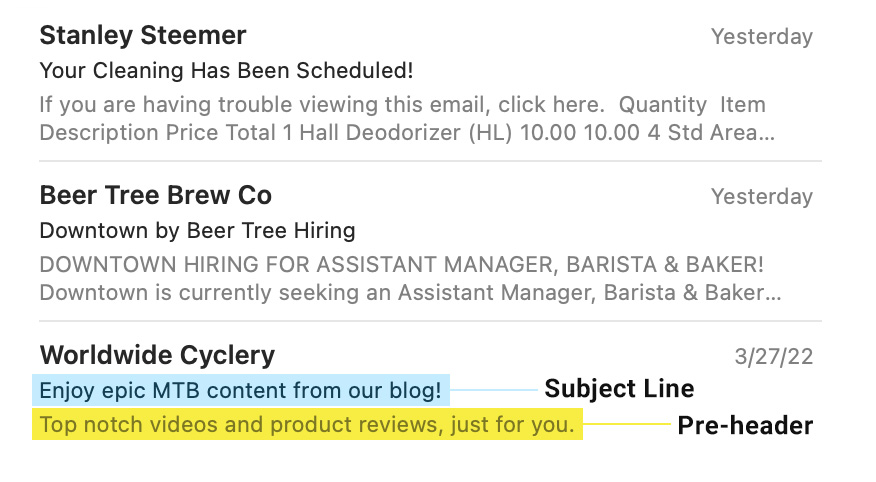
Your subject line is the first impression the viewer will have of your email, especially when using a screen reader. This will set the stage and give context to the reader about what the email contains, so they will know right away if the content applies to them. Avoid confusing phrasing, overly technical terms, or anything else that may confuse the reader or be easily misunderstood when read by a screen reader. It’s helpful to think of how Siri, Alexa or Google Assistant reads emails. Typically, they will read the subject line first and then the pre-header text to give some background.

Pre-headers and subject lines example image
Example of how a subject line and pre-header text appears in your mobile inbox.

Avoid designing image-only emails

Though it may be easier to simply design an all-image email, it’s challenging to make them accessible. Screen readers cannot interpret the content of an image and instead rely solely on “live text.” Live text is any form of copy contained in the email’s HTML code, which is immediately available when the email loads.

It will also be difficult to describe an all-image email using “alt text.” Alt text is live text that is embedded in an image’s HTML code that, when the image doesn’t load or a screen reader is in use, will be visible and readable in place of the image. If a screen reader can’t discern your email, you will likely ‌see a decrease in engagement and subscriber retention.

Use acceptable color contrast

Contrast ratio is important for design of any kind. Contrast is the difference between a background color and a foreground color, which is vitally important to those with visual impairments.

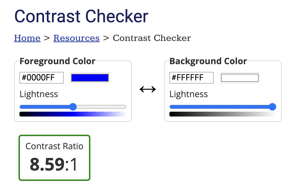
To test this for yourself, run your color scheme through a contrast checker. A 1:1 ratio has little contrast, while black text on a white background has a 21:1 ratio—the highest possible result. The Web Content Accessibility Guidelines (WCAG) recommend a minimum ratio of 4.5:1 for anything under 18pt, and 3:1 for text larger than 23pt.

Contrast checker preview
The results from the contrast checker will look similar to this, giving you an indicator that’s either green (good contrast) or red (bad contrast).

Make sure your text is readable

Small font sizes are hard to read, whether you’re partially blind or simply trying to read an email on your phone. To enhance readability, make sure your fonts are at least 14pt, though this recommendation may vary since not all fonts are a uniform size.

Consider your typography and general type layout as well—your font should be legible, spaced appropriately, and kept in a logical reading structure. Center-aligned paragraphs are ‌harder to read for those with dyslexia, so when in doubt, stick to left-aligned paragraphs.

Differentiate your links

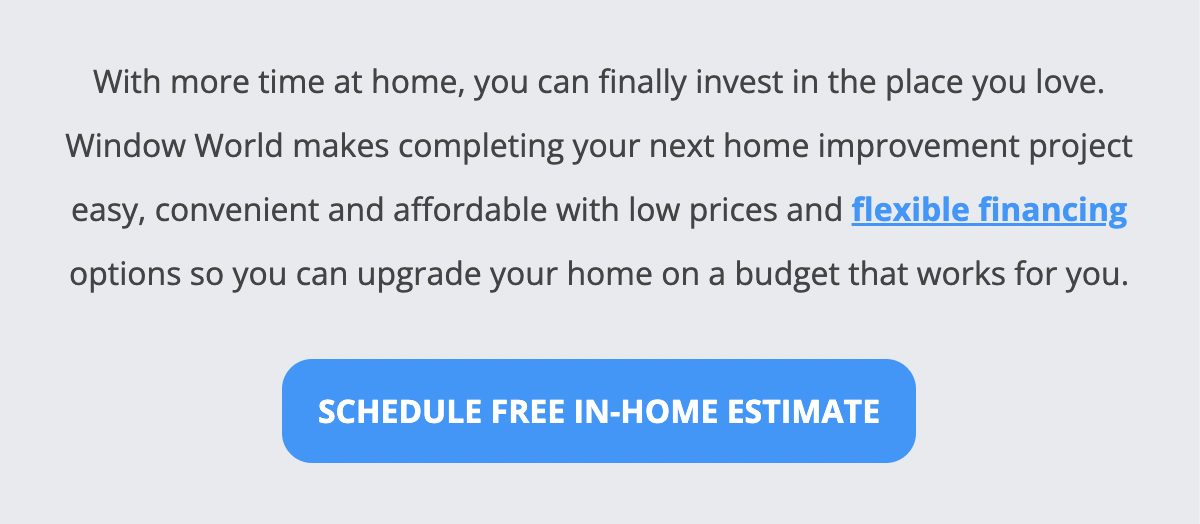
If someone with colorblindness reads your email, it’s important to set your links apart from the main body copy. Make sure that the inline links stand out and look clickable. Consider color contrast in this situation as well, as this will make the link’s clickability apparent for people both with and without visual impairments.

High contrast CTA and link example
The above example shows an inline link and CTA button with bright, high-contrast colors that set them apart from the rest of the body copy.

Don’t forget about dark mode!

Dark mode is a display option that has been slowly creeping into the email design world for several years. Dark mode inverts the colors in an email—meaning dark text is converted to light and light backgrounds are converted to dark.

The above email shows how Gmail inverts email colors when dark mode is in use.

At first glance, this seems like a good way to reduce eye strain for viewers, but it also produces more problems when it comes to making sure the color contrast in your design is accessible. Email clients are also inconsistent in the way they transition an email to dark mode. This blog post from email marketing platform Litmus provides an overview of how different email clients handle dark mode.

Is there a simple way to solve for accessibility in dark mode? Unfortunately not. The best solution is to research your audience (such as what email clients they are primarily using) and extensively test the email you plan to send. Check it in your inbox on desktop and mobile, view it in dark mode, and test it in various clients.

Compassionate Marketing Is Important

While ROI is certainly critical to a good marketing strategy, it’s also important to walk in the shoes of your customers and subscribers. Providing the best possible design experience to your clients, regardless of ability, allows you to better connect with your audience and contribute to a more inclusive industry.

  • Top 5 Social Media Trends for Businesses in 2022
    TriMark office space

By Eugenia Hart, Social Media Strategist

Year after year, social media continues to expand the user experience and how we consume our favorite brands online. In its infancy, social media was primarily used to keep up with family and friends. It has since metamorphosed into an advertising candy shop.

Social media remains the ultimate playground to create engaged digital communities and the ideal space to convert fans into customers. Social app giants are ever-evolving as they find innovative ways to keep consumers engaged and scrolling for longer periods of time. It’s no surprise that brands are investing in this funnel to capture their audience’s attention.

So, what’s worth keeping your eye on in 2022? We’re sharing the top social media trends for businesses to pay attention to in the new year.

1. Influencers Run the World

OK, so maybe not the world. But it’s no surprise that the Creator economy is now worth over $100 billion and is projected to grow every year. Evidence of influencer value is seen in how social media leaders TikTok, Instagram, Pinterest and even LinkedIn are investing in Creator marketplaces. Creator marketplaces serve as a venue for creators and brands to discover one another and connect with ease. Millions have been allocated to creating these tools that cater to influencers.

2. Short-Form Video Is King

When we think about capturing the audience’s attention, short-form vertical video is king. The shorter the video length, the better. Being able to capture the attention of the viewer in the first 3 seconds and video view completion rate are two of the top metrics that differentiate a low-engagement post from one that skyrockets to virality.

Studies show that short-form videos on Instagram get more engagement—more than its competitor TikTok! Extra engagement points if the video production is less polished, spur-of-the-moment or incorporates unedited Live video feed content.

If you haven’t implemented video into your brand content strategy, now is a better time than any to jump on board.

3. Brand Transparency On Social Justice Issues

With the rise of highly publicized social justice concerns, many brands spoke out against racism with brand messaging declaring a want to listen, learn, and do better. The consumer demand to know a company’s stance on certain issues will only climb, forcing brands to rethink how they respond to social issues.

Additional topics that matter to consumers include body inclusivity in marketing, environmental activism and maternal and paternity leave. We shared our fave brands that took on social issues by navigating these worthy conversations. More and more customers are taking a harder look at where they spend their dollars and what brands decide to address issues that are central to their personal values.

4. Social Commerce Becomes the Norm

$1.2 trillion. Yup. It’s expected that social commerce will reach incredible heights in profit and popularity. Social media has become the one-stop-shop for a shopping experience. From product discovery to click-to-purchase and post-purchase support, everything is happening without ever having to leave the social platform. Evidence shows that over 70% of small businesses opt to sell on social media.

5. Continued Focus on Mental Health and Burnout

With lockdowns, working from home, and an increase in time spent online, mental health and burnout have affected everyone. Instagram is really leading the charge by displaying the importance of stepping away from screens via their Take a Break feature

This tool allows Instagram users the option to take a break from scrolling. It comes with expert-backed tips on how to limit screen time. Time will tell if other social platforms follow suit in the new year.

Social media remains a wild wave with new features to learn, new audiences to reach, and intriguing stories to tell. The opportunities are endless. If you’ve made it this far, you MUST want to read our take on marketing trends to follow in 2022.